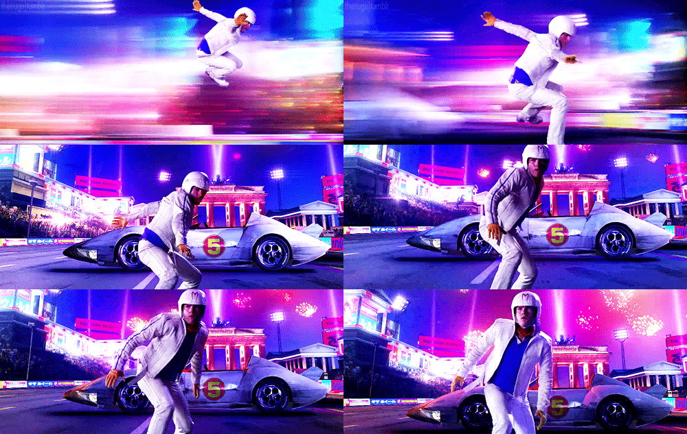
SPEED RACER: Aesthetic Language
If you’re one of the few people who flocked to the theatres to see the Wachowski siblings’ 2008 adaptation of SPEED RACER, then you probably left perplexed. And with good reason. The 120 million dollar film barely cracked 94 million at the worldwide box office, making for a titanic flop that was critically panned. The critics declared it a film loaded with nauseating special effects and an incoherent plot. Today, it retains a 39% score on Rotten Tomatoes, a warning sign for any that dare unearth it. And while none of the criticisms are incorrect, they also feature a tremendous oversight.
You see, what if I were to tell you that SPEED RACER is good? In fact, what if I were to tell you that SPEED RACER is magnificent? I remember when the Wachowskis released their film and early reviews made me avoid it like the plague. But on a summer day in 2014, I sat behind a 10-year-old boy on a flight to Thessaloniki, and peered over his shoulder, flabbergasted by the visual audacity of a film that we have written off as a flaming trash heap. It was at this point that I began to consider just how much style can influence substance.
I know many that are sure to run in defense of the Wachowskis regardless of which cinematic effort is under the microscope. I’m not one of these people. The fact of the matter remains that the track record of the duo has been rocky to say the least, featuring complete trainwrecks like 2015’s JUPITER ASCENDING, and the ambitious yet fundamentally flawed exercise that was CLOUD ATLAS in 2012.

With SPEED RACER, we have a film that predates James Cameron’s visual epic, AVATAR, by a mere year, and yet boasts visual effects that throw that film back into the stone age. I think it’s important to keep the shoddy CG and green-screen work in mind when exploring the formal qualities of such a film. Whilst its narrative might be interpreted as hollow, it’s the aesthetic of SPEED RACER that embeds it with a notion of catharsis that is absent in most sports films.
SPEED RACER is an underdog story that achieves all of its emotional high notes in the midst of operatic action. As such, opulence is front and center in creating a visual language for the viewer. And the Wachowskis roll with this in a way that manifests so subconsciously that many are sure to write off the film as lacking in narrative coherency. But where it admittedly fails to expand character depth, it excels in the internal struggle of fulfilling one’s destiny, allowing the viewer to quite literally step into the shoes of Speed Racer.
The truth is that majority of SPEED RACER’s plot developments are handled like sponges, filling up only to be effortlessly wringed out before the stakes are too high. But what better way to reinterpret a children’s cartoon than ending every narrative beat with a charming “I’ll get you next time, Speed”? Admittedly, in doing so, the Wachowskis put themselves in a tight position. In a way, the film’s stakes are never particularly high for the external conflict. Because of this, the action during the races isn’t exactly earned. Or is it? To solve their problem, the Wachowskis decide to earn the action by seamlessly integrating the identity of the vehicle with that of the character.
https://www.youtube.com/watch?v=QIjt-AOSlyE
Yes, Speed has to race the deadly Caso Cristo 5000, and his father’s business faces closure, but the things that really matter, the respect of his family and the love of his girlfriend, are never put to the test. Instead, SPEED RACER is fundamentally about honor, destiny, talent, and the sport of racing. It is a narrative that lives and breathes through the ideology that “money doesn’t win you the Grand Prix, being the best driver does.” Compared to other racecar films, one begins to notice that the film’s star Emile Hirsch and his Mach 5 are one and the same. When the Mach 5 is damaged, Hirsch is in pain, and when Matthew Fox punches an enemy driver, their car can’t accomplish the task it was already doing, binding the power of the car and the driver.
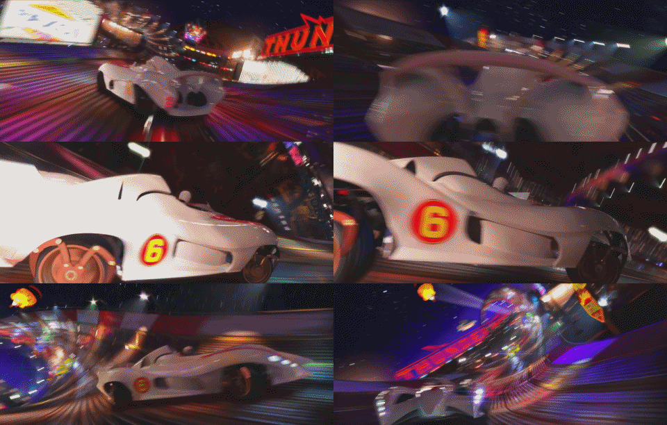
Where ROCKY can showcase Stallone beefing up for the fight, there’s not much Hirsch can do as an actor to showcase his growth as a racer other than, well, just racing better next time. It’s a structural roadbump that countless films face when power cannot be quantified. The best comparison is actually any Superman film, because Clark Kent rarely defeats an enemy by any means other than pushing and yelling harder the second time around. When Hirsch races on the Thunderhead Raceway, we don’t need to be told that his brother has inspired him to drive perfectly, it is shown to us through an image of the Mach 5 elegantly swooping through the spirit of his brothers car.
https://www.youtube.com/watch?v=h3B64O2iCp8
Via the aesthetic arrangement of SPEED RACER, the Wachowskis actually manage to overcome the hurdle of showcasing a character’s emotion through a car’s behavior. SPEED RACER commands a cinematic language of its own, one that it has invented on the cutting room floor. Amidst all of the spastic, ADHD-laden visuals is a film that consistently transitions from scene to scene with nauseating wipes, whip pans, and elementary special effects. And while some might argue that it lacks visual polish, any jarring imagery ultimately only doubles down on how formalist it can be during its charming Grand Prix.
It’s an aesthetic viewers have to learn in order to get in the driver’s seat. As such, the hurdles of each race are overcome through the audience’s commitment to learning the formal qualities that constitute SPEED RACER’s aesthetic. See, the Wachowskis are extremely quick to the draw, flying through exposition at the same speed that the cars drive. The amount of information that is relayed to the audience in the first 20 minutes is masterful, utilizing every cinematic tool to craft a campy but effectively bubbly tribute to the art of manga and anime.
What’s unique here is that SPEED RACER doesn’t necessarily ape comic book panels as much as it harkens back to the way a child’s mind interprets the invisible transitions between these images. Where Zack Snyder’s WATCHMEN is a panel-for-panel recreation, SPEED RACER challenges our conceptions of coverage in order to deliver dialogue scenes that don’t edit so much as float around the audience in a 360-degree whirlwind, chock full of wipes and invisible edits. It’s hard to articulate because, of course, SPEED RACER takes place on a 2D screen, but through the endless use of wipe transitions, viewers who are really locked into the spectacle feel like they’re spinning around the space rather than the other way around.

But perhaps the film’s most lasting achievement is its timing of edits. SPEED RACER is fast, and I mean really fast, consumption, a cinematic ghost pepper that circulates through the bloodstream with such force that its two-hour runtime virtually evaporates into the seamless transition between scenes. And while the film’s cutaways, transitions, and scenes all play out at the breakneck pace of a tommy gun, it’s the gradually increasing momentum that helps indicate where things really get popping.
When only looking at individual moments of SPEED RACER, one fundamental thing is lost: the Wachowskis’ masterful modulation of velocity. This is something that can only be appreciated when the film is consumed in one sitting. When dialogue becomes important, edits slow down to a screeching halt, and when an insurmountable obstacle is overcome on the racetrack, the Wachowskis pull the handbrake on the rapid edits, incorporating slow motion in brief increments. Through this technique, SPEED RACER is arguably a nauseating visual experience, popping with candy colors and jarring computer-generated renders.
But as the eye grows used to this approach over the course of two hours, the Wachowskis catapult their protagonist into the Grand Prix. And in the final leg of this exhilarating race, viewers have become so tuned into the spastic rush of the Wachowskis’ edits that they turn the dial up to eleven. Causing the roadwork patterns to blend into a 2001: A SPACE ODYSSEY-esque fusion of colors and shapes, the adrenaline rush of coming in first place is cathartically captured through the Wachowskis’ form alone. Character doesn’t matter anymore, you have been along for the ride long enough to become Speed Racer. Style has become substance.
And the moment the car stops moving, so do the edits. Despite everything we’ve been conditioned to expect in this film, whether it be spinning talking head scenes or sugared green screen chases featuring a chimpanzee, the Wachowskis conclude their film with exactly the aesthetic antithesis of the preceding two hours. The imagery moves in slow-motion, our heroes cheer, and the convulsive imagery unfolds into a more traditional array of iconography, signaling the end of our hero’s journey.
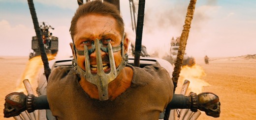
While the charming, colorful glory of SPEED RACER is something that only every other viewer will really take their time to appreciate, I think it’s important to note that more films have been inspired by the Wachowskis than care to admit. While MAD MAX: FURY ROAD certainly had George Miller’s trilogy as background, it takes notes from SPEED RACER’s careful composition to create controlled switches between wide shots and close-ups, allowing for the eye not to get completely lost in the madness of the aesthetic.
Because the Wachowskis so tightly bind Speed Racer to his Mach 5, the editing between dialogue and racing is hardly any different, allowing the climax of the film to reveal what his life is like when the brakes have finally been activated. Where MAD MAX: FURY ROAD certainly had a more impressionable narrative going in its favor, SPEED RACER understands that catharsis can be accomplished entirely through form, allowing the visual execution to inform on the substance of the narrative, rather than the actors’ performances. So although we may never remember SPEED RACER as the aesthetic landmark that it is, it’s worth considering just how valuable style can be.


